Woodland Heritage
Re-branding / web design
- CATEGORIES: Branding, Logo Design & Website design
- DATE: July 2018 onwards
- CLIENT: Woodland Heritage, Gloucesteshire, UK
- woodlandheritage.org
Details
Woodland Heritage is a UK based charity who promote the planting and management of British woodland and aim to link up members of the timber supply chain in Britain from growers to makers.
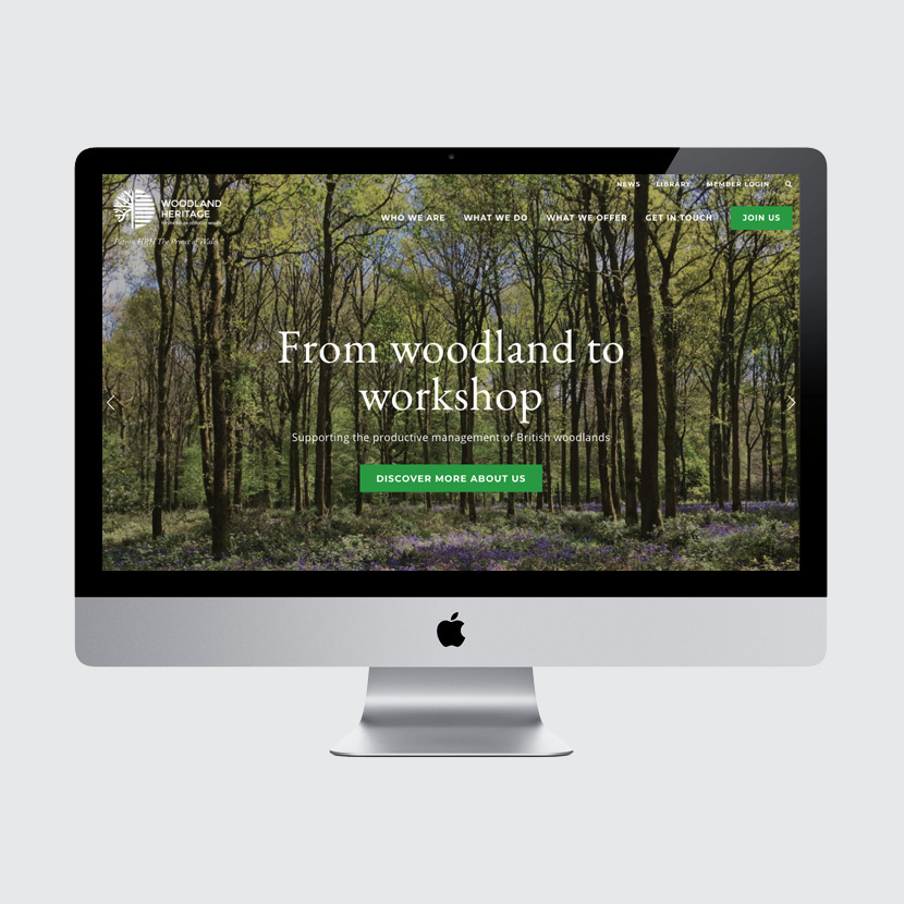
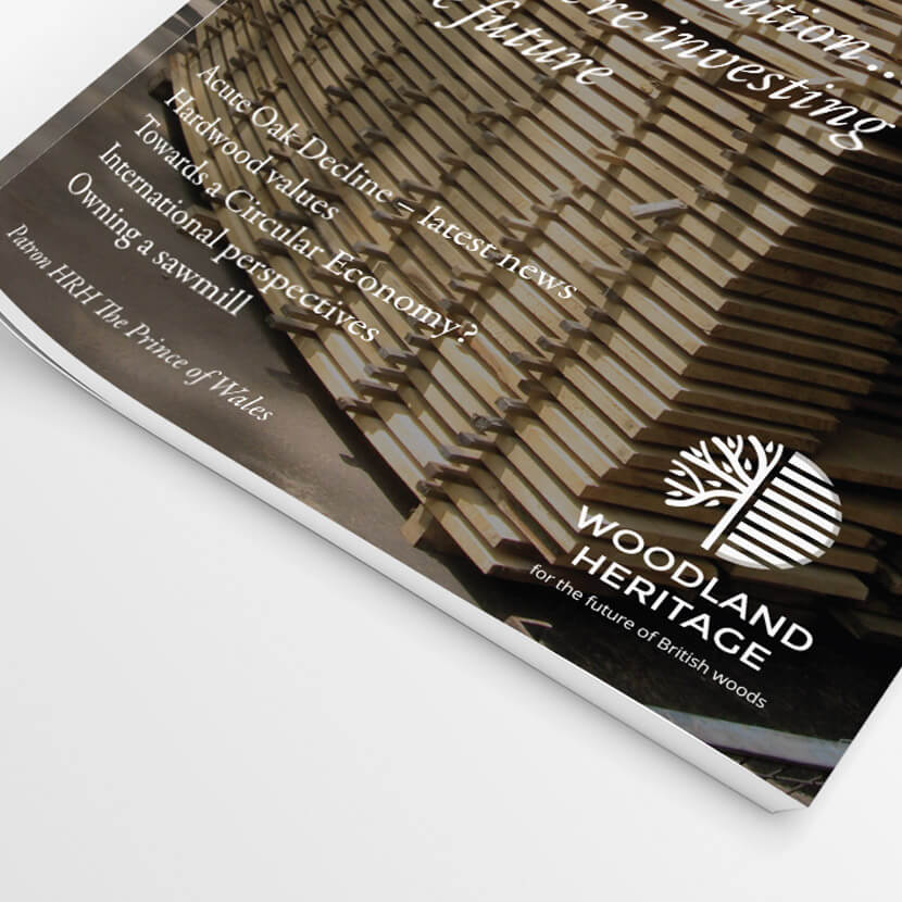
Over the last 10 years I have worked with Woodland Heritage on various projects, staring with a re-design of their logo. Following this, I re-designed their website to make updating this a simpler process for all involved, settling on a bespoke Squarespace build.
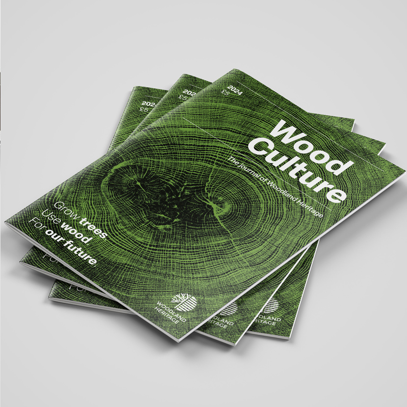
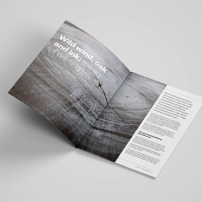
More recently I have worked on an update to the design of the annual journal, to help engage with their current supporters as well as promoting their work to potential new donors.


